THE LOGO
The ubiquitous OSCA logo, fully matured by late 1949, allows a rare and important glimpse into the design and brand language of OSCA. Throughout their active years at OSCA, the three Maserati bothers did not pay much attention to branding and marketing efforts, deciding to focus entirely on designing and building cars. The company’s logo, however, was a fully developed and well thought out brand and design language effort. The end result was that a round logo representing the brand was a consistent feature on all OSCA products from inception.
The OSCA logo represents a fairly common period design language for European sports related car brands. There are specific features and details of the logo which help us understand the thinking behind the OSCA brand. Below we shall analyze the logo’s features.
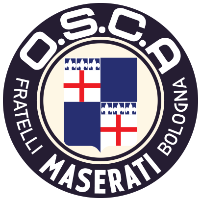
The round circular shape, speaks of practical simplicity - the engineer’s attitude, and echoes a “down to earth” brand language. Unlike the period Ferrari or Porsche elaborate crest-shaped logos, the “nobility” crest shape was forgone for a much more “plain” round contour. One could interpret this as a political statement of “no pretention branding”, or new world simplicity.
Variations:
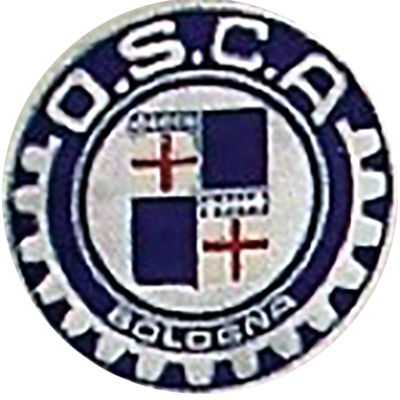
1947-1949:
This logo was briefly used at outset of the enterprise until sometime in late 1949, mounted on OSCA cars (MT4 chassis 1101-1110). By late 1949, this logo was replaced by the design that has become the most commonly associated OSCA logo. The early design did not use the name Maserati, instead creating a slightly more elaborate logo with the sprocket graphics, replacing instead of the placement of the racing winner laurels.
The apparent Logic behind using the Sprocket in a such prominent role could be many folds but summarized as:
This emblem ceased to be used once the MT4 model became a true winner at the circuits and was replaced with the Maserati themed emblem below.
Oddly, the early logo continues to sporadically appear in some OSCA letterhead and other official documents well into 1957. It remains a mystery as to why would the outdated logo be used in official correspondence almost a decade after its obsolescence.
1949-1965:
Beginning in late 1949 and lasting through its halcyon years, this logo design (analyzed above), is considered the most recognized of the logo iterations. In fact, it continued to adorn the nose badge of all OSCA products until the company’s demise, becoming an omnipresent feature everywhere the OSCA cars went.
Oddly enough the terms of the sale contract with Orsi were never clearly disclosed, so the use of the name “Maserati” appearing in such prominence on the emblem, and replacing the early sprocket design, must have necessitated the pre-approval of the Orsi family, or the expiration of terms in the sales contract.
1960-1965:
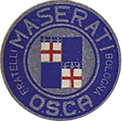
The final version of the logo appears rarely and only in the 1600GT/GTV/GTS series of cars, late in the company’s production life. It features a bold move to position the Maserati name at the top location and by virtue of the font size, it becomes the most prominent feature of the logo. In addition, the direction of the writing “FRATELLI” and “BOLOGNA” changed directions, in a dramatic reworking of the logo. Replacing the white background with silver, created a slightly less visually appealing logo.
This logo was placed inside the interior of the GT series cars, mainly embossed on the gauges and steering wheel horn button. Note that the outside emblem of the 1600GT series still had the standard OSCA logo used since 1949.
Some late official OSCA letterhead contained this logo, starting in early 1961, signaling that this branding shift was firm wide and not only relegated to interior design on the GT cars.
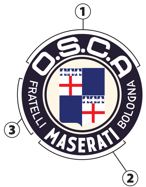 The typography in the logo provides insight, information and detail to much of the OSCA brand identity. By analyzing the writing and its location, we can understand much of the what the three Maserati brothers set to achieve.